top of page

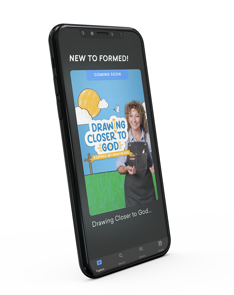
Join art teacher Ms. Kim in this exclusive children's series Drawing Closer to God: A Catholic Art Show For Kids. As kids follow along and learn new art skills, they also learn to see the connections between the big picture of God's story and their place within it.
Teaching the Faith

Choosing a playful blue and gold as the brand standard for the show was an intentional nod to the parent company's own brand colors (dark blue and gold).
Color Palette


Augustine Institute Studios wanted to target a demographic of 6-8 year olds for their show. After a couple various logo developments, we landed on this sticker concept. Mixing some playful type and colors, along with a signature pencil in the negative space of the "i", we discovered a logo that was both age appropriate and professional.

The Logo

Drawing Closer to God
BRAND CASE STUDY

The typeface was the key discovery in uncovering this brand. Striking the right balance between playful, legible, and age appropriate—we went with the font "Nice Sugar" as the brand type, with "Sailec" for body copy.
Typography


The brand imagery for Drawing Closer to God was intended to target parents, showcasing both the high production value and value it would bring to the family. Imagery included children enjoying creating the art and the versatility of the show playable across numerous platforms.

Imagery


Putting it all Together
Employing the logo, type, imagery and colors—Drawing Closer to God came to life through various marketing collateral. From digital ads and emails, to print and press releases, we were proud to see this new kids show hit the market with great success.


bottom of page